
UPDATE: As @hryx pointed out on Twitter, the app is called SF.gov but the website is actually sfgov.org. SF.gov isn’t a website. Even the name of the app is an exercise in failure!
Why does the SF.gov iPhone app suck? We live in a city filled with iOS software developers. Any of them could do a better job than this.
Look, I’m not that picky when it comes to software. But I’m not going to put up with your app if it’s slower than anything I’ve ever seen, buggy as hell, and haphazardly organized.
Let me explain.
Let’s start with those tab buttons at the bottom of the screen. Check the screenshot above.
When you press one of those, you probably think it will switch to the corresponding screen. That’s because you’re not the alcoholic middle school drop out who wrote this app.
No, instead one of the following happens when you press a tab button:
- It will switch to the screen you pressed.
- It will switch to the screen you pressed, but there will be a “loading” screen that has a few extra buttons at the top of the screen for a fraction of a second (I couldn’t read fast enough to see what they said.)
- It won’t switch and will stay at the same screen.
- Several screens will flash by rapidly, and eventually the screen will turn white and lock up. You’ll have to force quit the app.
You have to hand it to this application, it’s original — no other app has those bugs.
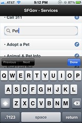
The most useless tab is “services.” There’s only two options: calling 311, or a search box. The first option is self-explanatory. Strangely they don’t let you fill out a 311 report in the app; that requires a separate app that has completely different bugs.
The little search box gives no indication as to what it does. As you start typing into the box, titles appear below in a list. But you can only see two of them when the keyboard is open. You have to click the Done button to make the keyboard go away. If you skip that step and try to scroll the page, it will take you to the first page in the list. It’s not like you’re kind of busy when you’re using your phone to look up information. No, you have all the time in the world to tinker with UI glitches.
Whatever you click, it takes you to a mobile version of the SF.gov website. The browser is Safari, but for some reason it’s agonizingly slow. Fortunately there’s an unlabelled button which — as I discovered through trial and error — sends the page to Safari.
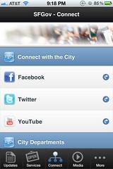
On the connect tab you can find Facebook, Twitter, and YouTube links for SF.gov and other city services. Each of these opens in the agonizingly slow version of Safari included in this app. None of this will help you get your car back after it got towed for too many street sweeping tickets, so don’t bother with this section. It’s largely links to irrelevant city press releases.
What’s more interesting is the photo at the top of this section. It seems to depict the last thing someone saw as their eyes closed and they died while waiting in line at City Hall. (Click the image above to see for yourself.)
In case you were wondering, the Updates, Media, and More sections are also just lists of links to websites. Why most/all of these links didn’t belong in “Services” or “Connect” is anyone’s guess. Like all the lists of things in this app, they don’t scroll smoothly but instead jerk around slowly.
Everything in this app suffers from the same basic problem: you shouldn’t get pregnant with your pet ape, give birth to the ape-man-baby out of your ass, buy it a Mac and then teach it programming so it can make an SF.gov app. That’s just not humane.